2025
Autoimmune Health Tracker App
Designing for Dignity: A Health Tracker That Puts Patients First
Product Design
0-1 App Creation
Know More
Autoimmune conditions are complex, misunderstood, and often dismissed. This project set out to build a daily health companion for patients a mobile-first experience that made it easy to track symptoms, manage care, and speak up with clarity in clinical conversations.
The Autoimmune Health Tracker: Designed for Daily Use, Built for Better Care
Living with autoimmune conditions means managing chaos unpredictable flare-ups, confusing triggers, and inconsistent support from care providers. Most health apps either overcomplicate or oversimplify. We wanted to build something better: a tool patients would actually use, and doctors would actually trust.
I led the product design and systems architecture from concept to prototype. We focused on one core goal: give users control over their health narrative. This wasn’t about gamifying wellness it was about making pain, fatigue, and patterns visible. In doing so, we empowered users with language, data, and structure for better conversations and outcomes.

Health Data That Reflects Real Life
Built Around the Human, Not the Condition
Most symptom trackers are built for clinicians. We built this one for people living through it.
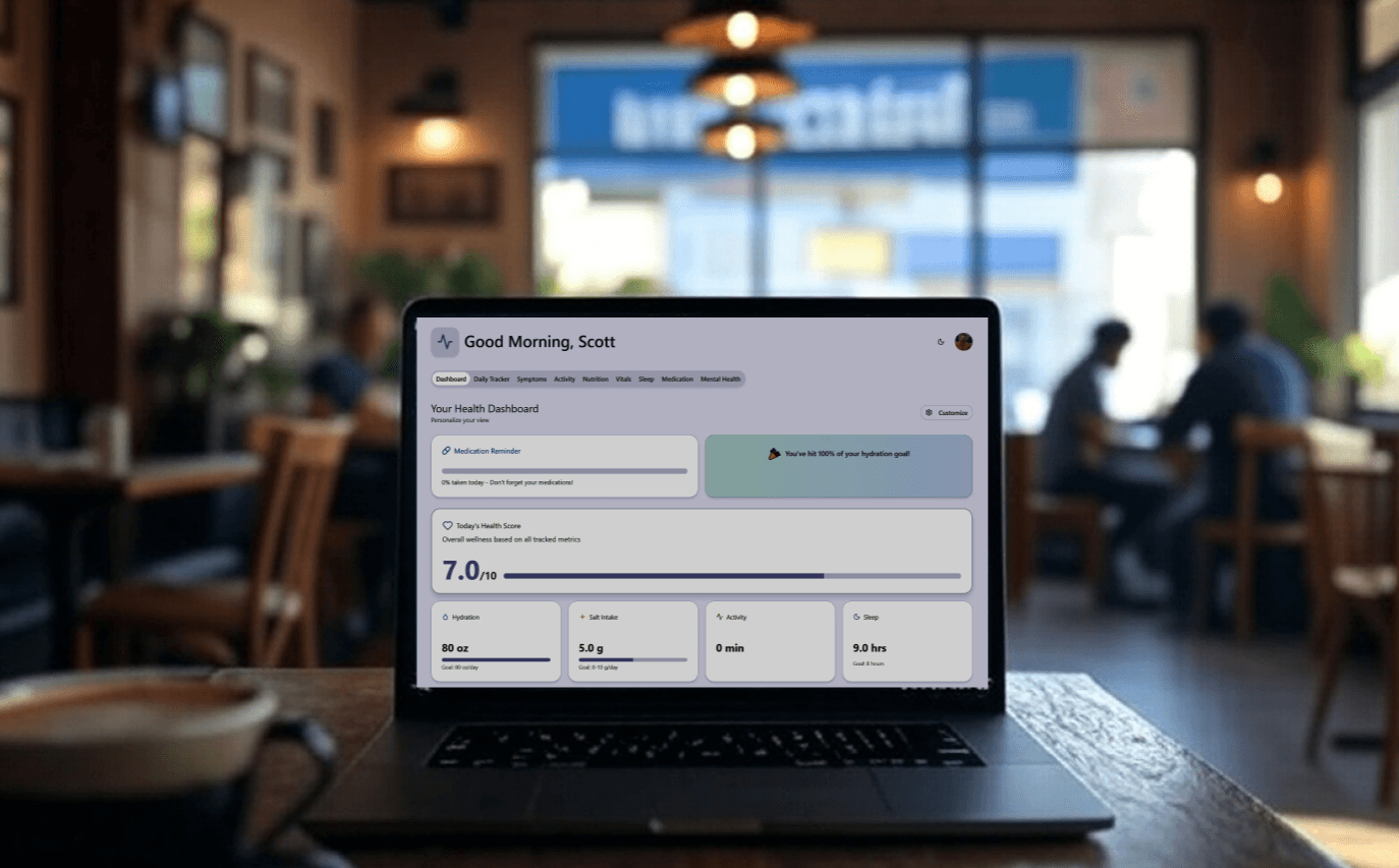
Through interviews with autoimmune patients, we learned what mattered: being heard, being believed, and being able to show patterns. The app made it easy to track daily symptoms, food intake, hydration, exercise, stress, medication, and environmental triggers all in under 60 seconds a day.
We designed emoji-enhanced logging, custom sliders, and “today I feel” quick-entry modes. The UI was clean, soft, and emotionally intelligent no sterile charts or condescending checkboxes.


From Notes to Insights: Making Data Actionable
Clarity for Both the Patient and the Provider
Raw data is overwhelming especially for people managing chronic illness. We built visualizations that turned input into insight.
The app included:
Weekly and Monthly Pattern Reports for personal reflection
Doctor Report Mode: a clean, exportable summary patients could bring to appointments
Trigger Correlation Engine: surfaced likely links between food, weather, stress, and symptoms
We didn’t bury users in graphs. We highlighted what changed, what stayed consistent, and what needed attention always with an option to export or print.

Designed With Patients, Not Just for Them
Every Feature Validated by Lived Experience
This app wasn’t built in a vacuum. We co-designed with a pilot group of autoimmune patients people managing lupus, Hashimoto’s, Crohn’s, and POTS. Their feedback shaped every interaction, from language to load time.
We focused heavily on accessibility and emotional safety:
Color contrast compliant and dark mode ready
Logging screens optimized for flare-up days with fewer taps and larger targets
Language reviewed to avoid ableist or patronizing phrasing
We didn’t just ask for feedback we made patients co-owners in the process. Their voices are in the interface.
Outcomes & Early Impact
Metric | Result |
|---|---|
Daily log completion (beta users) | 87% after 30 days |
Symptom → trigger correlation accuracy | 72% match (validated by users) |
Doctor report usage | 94% of users printed/exported at least once |
Emotional trust rating (usability testing) | 4.7/5 avg |
“Would you recommend to someone else?” | 100% said yes |
“This app helped me show my doctor I wasn’t exaggerating. It changed the conversation.” Beta User, Age 32
Reflection & Learnings
Patients don’t want dashboards they want support and proof
Accessibility is more than compliance it’s compassion at scale
Designing for chronic illness requires humility, flexibility, and iteration
Success isn’t just features it’s how it feels to use on your worst day
Artifacts & Conversation Starters
Daily logging UI with “flare day” mode toggle
Doctor Report PDF template and logic
Food & Symptom Correlation matrix
Research insights board from co-design sessions
Interview clips: “Why I stopped using other health apps”
Quick Summary
We designed a mobile health tracker that autoimmune patients actually want to use intuitive, empathetic, and clinically relevant. The result is better personal insight, clearer conversations with care teams, and a sense of control in a world that often feels chaotic.
Health isn’t just clinical. It’s personal. We designed for both.

More Works
DIGITAL MACGYVER
©1985


FAQ
01
What exactly does Digital MacGyver do?
02
Who hires you?
03
How do your consulting engagements work?
04
What’s your process like?
05
Do you offer coaching or mentorship?
06
What’s the difference between consulting and coaching with you?
07
How easy is it to edit for beginners?
08
Do I need to know how to code?
2025
Autoimmune Health Tracker App
Designing for Dignity: A Health Tracker That Puts Patients First
Product Design
0-1 App Creation
Know More
Autoimmune conditions are complex, misunderstood, and often dismissed. This project set out to build a daily health companion for patients a mobile-first experience that made it easy to track symptoms, manage care, and speak up with clarity in clinical conversations.
The Autoimmune Health Tracker: Designed for Daily Use, Built for Better Care
Living with autoimmune conditions means managing chaos unpredictable flare-ups, confusing triggers, and inconsistent support from care providers. Most health apps either overcomplicate or oversimplify. We wanted to build something better: a tool patients would actually use, and doctors would actually trust.
I led the product design and systems architecture from concept to prototype. We focused on one core goal: give users control over their health narrative. This wasn’t about gamifying wellness it was about making pain, fatigue, and patterns visible. In doing so, we empowered users with language, data, and structure for better conversations and outcomes.
Health Data That Reflects Real Life
Built Around the Human, Not the Condition
Most symptom trackers are built for clinicians. We built this one for people living through it.
Through interviews with autoimmune patients, we learned what mattered: being heard, being believed, and being able to show patterns. The app made it easy to track daily symptoms, food intake, hydration, exercise, stress, medication, and environmental triggers all in under 60 seconds a day.
We designed emoji-enhanced logging, custom sliders, and “today I feel” quick-entry modes. The UI was clean, soft, and emotionally intelligent no sterile charts or condescending checkboxes.
From Notes to Insights: Making Data Actionable
Clarity for Both the Patient and the Provider
Raw data is overwhelming especially for people managing chronic illness. We built visualizations that turned input into insight.
The app included:
Weekly and Monthly Pattern Reports for personal reflection
Doctor Report Mode: a clean, exportable summary patients could bring to appointments
Trigger Correlation Engine: surfaced likely links between food, weather, stress, and symptoms
We didn’t bury users in graphs. We highlighted what changed, what stayed consistent, and what needed attention always with an option to export or print.
Designed With Patients, Not Just for Them
Every Feature Validated by Lived Experience
This app wasn’t built in a vacuum. We co-designed with a pilot group of autoimmune patients people managing lupus, Hashimoto’s, Crohn’s, and POTS. Their feedback shaped every interaction, from language to load time.
We focused heavily on accessibility and emotional safety:
Color contrast compliant and dark mode ready
Logging screens optimized for flare-up days with fewer taps and larger targets
Language reviewed to avoid ableist or patronizing phrasing
We didn’t just ask for feedback we made patients co-owners in the process. Their voices are in the interface.
Outcomes & Early Impact
Metric | Result |
|---|---|
Daily log completion (beta users) | 87% after 30 days |
Symptom → trigger correlation accuracy | 72% match (validated by users) |
Doctor report usage | 94% of users printed/exported at least once |
Emotional trust rating (usability testing) | 4.7/5 avg |
“Would you recommend to someone else?” | 100% said yes |
“This app helped me show my doctor I wasn’t exaggerating. It changed the conversation.” Beta User, Age 32
Reflection & Learnings
Patients don’t want dashboards they want support and proof
Accessibility is more than compliance it’s compassion at scale
Designing for chronic illness requires humility, flexibility, and iteration
Success isn’t just features it’s how it feels to use on your worst day
Artifacts & Conversation Starters
Daily logging UI with “flare day” mode toggle
Doctor Report PDF template and logic
Food & Symptom Correlation matrix
Research insights board from co-design sessions
Interview clips: “Why I stopped using other health apps”
Quick Summary
We designed a mobile health tracker that autoimmune patients actually want to use intuitive, empathetic, and clinically relevant. The result is better personal insight, clearer conversations with care teams, and a sense of control in a world that often feels chaotic.
Health isn’t just clinical. It’s personal. We designed for both.
More Works
DIGITAL MACGYVER
©1985
FAQ
01
What exactly does Digital MacGyver do?
02
Who hires you?
03
How do your consulting engagements work?
04
What’s your process like?
05
Do you offer coaching or mentorship?
06
What’s the difference between consulting and coaching with you?
07
How easy is it to edit for beginners?
08
Do I need to know how to code?
2025
Autoimmune Health Tracker App
Designing for Dignity: A Health Tracker That Puts Patients First
Product Design
0-1 App Creation
Know More
Autoimmune conditions are complex, misunderstood, and often dismissed. This project set out to build a daily health companion for patients a mobile-first experience that made it easy to track symptoms, manage care, and speak up with clarity in clinical conversations.
The Autoimmune Health Tracker: Designed for Daily Use, Built for Better Care
Living with autoimmune conditions means managing chaos unpredictable flare-ups, confusing triggers, and inconsistent support from care providers. Most health apps either overcomplicate or oversimplify. We wanted to build something better: a tool patients would actually use, and doctors would actually trust.
I led the product design and systems architecture from concept to prototype. We focused on one core goal: give users control over their health narrative. This wasn’t about gamifying wellness it was about making pain, fatigue, and patterns visible. In doing so, we empowered users with language, data, and structure for better conversations and outcomes.
Health Data That Reflects Real Life
Built Around the Human, Not the Condition
Most symptom trackers are built for clinicians. We built this one for people living through it.
Through interviews with autoimmune patients, we learned what mattered: being heard, being believed, and being able to show patterns. The app made it easy to track daily symptoms, food intake, hydration, exercise, stress, medication, and environmental triggers all in under 60 seconds a day.
We designed emoji-enhanced logging, custom sliders, and “today I feel” quick-entry modes. The UI was clean, soft, and emotionally intelligent no sterile charts or condescending checkboxes.
From Notes to Insights: Making Data Actionable
Clarity for Both the Patient and the Provider
Raw data is overwhelming especially for people managing chronic illness. We built visualizations that turned input into insight.
The app included:
Weekly and Monthly Pattern Reports for personal reflection
Doctor Report Mode: a clean, exportable summary patients could bring to appointments
Trigger Correlation Engine: surfaced likely links between food, weather, stress, and symptoms
We didn’t bury users in graphs. We highlighted what changed, what stayed consistent, and what needed attention always with an option to export or print.
Designed With Patients, Not Just for Them
Every Feature Validated by Lived Experience
This app wasn’t built in a vacuum. We co-designed with a pilot group of autoimmune patients people managing lupus, Hashimoto’s, Crohn’s, and POTS. Their feedback shaped every interaction, from language to load time.
We focused heavily on accessibility and emotional safety:
Color contrast compliant and dark mode ready
Logging screens optimized for flare-up days with fewer taps and larger targets
Language reviewed to avoid ableist or patronizing phrasing
We didn’t just ask for feedback we made patients co-owners in the process. Their voices are in the interface.
Outcomes & Early Impact
Metric | Result |
|---|---|
Daily log completion (beta users) | 87% after 30 days |
Symptom → trigger correlation accuracy | 72% match (validated by users) |
Doctor report usage | 94% of users printed/exported at least once |
Emotional trust rating (usability testing) | 4.7/5 avg |
“Would you recommend to someone else?” | 100% said yes |
“This app helped me show my doctor I wasn’t exaggerating. It changed the conversation.” Beta User, Age 32
Reflection & Learnings
Patients don’t want dashboards they want support and proof
Accessibility is more than compliance it’s compassion at scale
Designing for chronic illness requires humility, flexibility, and iteration
Success isn’t just features it’s how it feels to use on your worst day
Artifacts & Conversation Starters
Daily logging UI with “flare day” mode toggle
Doctor Report PDF template and logic
Food & Symptom Correlation matrix
Research insights board from co-design sessions
Interview clips: “Why I stopped using other health apps”
Quick Summary
We designed a mobile health tracker that autoimmune patients actually want to use intuitive, empathetic, and clinically relevant. The result is better personal insight, clearer conversations with care teams, and a sense of control in a world that often feels chaotic.
Health isn’t just clinical. It’s personal. We designed for both.
More Works
©1985
FAQ
What exactly does Digital MacGyver do?
Who hires you?
How do your consulting engagements work?
What’s your process like?
Do you offer coaching or mentorship?
What’s the difference between consulting and coaching with you?
How easy is it to edit for beginners?
Do I need to know how to code?